SemiCircularNumberDisplay2 Control
Description
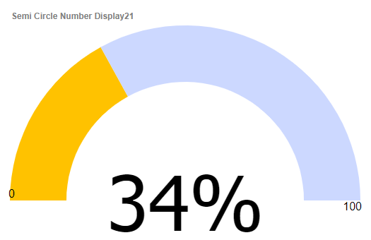
The SemiCircularNumberDisplay2 control can be used to display numeric data as a semi-circular chart.
Overview
The SemiCircularNumberDisplay2 control allows you to display a numeric value on a semi-circular chart. It is ideal for using in 'dashboard' type applications. You can configure the color of the control so that it changes depending on the value. For example if a numeric value is in the 'safe' zone, you might set the color to green, and if the value was in the 'danger' zone, you might set the control color to red.
Like other Data controls, the value of the SemiCircularNumberDisplay2 control can be set and read using the {dialog.object}.setValue() and {dialog.object}.getValue() methods. For example:
var increment = function (incrementBy) {
    var value = parseInt({dialog.object}.getValue('SemiCircleNumberDisplay21'),10);
    var newValue = Math.max(0,Math.min(value + incrementBy, 100));
    {dialog.object}.setValue('SemiCircleNumberDisplay21', newValue);
}
Adding a SemiCircularNumberDisplay2 Control
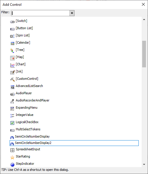
Click Add Control.
Locate the SemiCircularNumberDisplay2 control in the list and click it to add a Semi-circular Number Display control.
 Add Control dialog
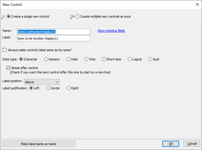
Configure the Name and Label for the control. You can optionally add multiple SemiCircularNumberDisplay2 controls by selecting Create multiple new controls at once. Click OK when you are satisfied with the settings.
 New Control dialog
Optionally the Default value for the control. Setting can be helpful when configuring the control's display, such as the color, line width, labels, etc.
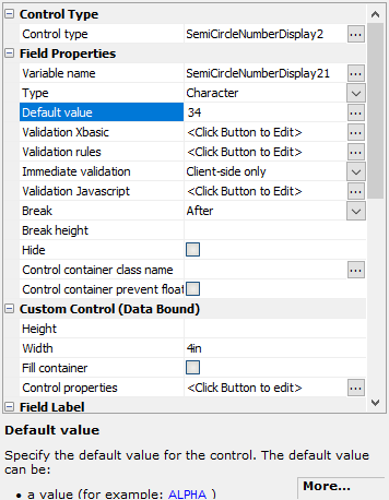 Default value
Click the
 smart field button for the control's Control Properties to configure the control.
 Control Properties
Configure the properties for the control. When you are satisfied with your control, click OK to save the changes.
Configuring Control Properties
The Semi-circular Number Display dialog contains several properties for customizing the display of the control.

Minimum Number
A number that defines the minimum value of the control. Default value is 0.
Maximum Number
A number that defines the maximum value of the control. Default value is 100.
Starting angle
The angle in degrees where the semi-circular number display begins relative to 12 o'clock. The default value is -90.
Ending angle
The angle in degrees where the semi-circular number display ends relative to 12 o'clock. The default value is 90.
Line Width (pixels)
The width in pixels of the bar displaying the control's value relative to the minimum and maximum values. Default value is 10.
Stretch
Whether or not the control should stretch to fill the control's container. If checked, the control will grow or shrink to fit in the defined area. If unchecked, the control will maintain a fixed width, defined by the width property below.
width
Shown when Stretch is unchecked. The width in pixels of the control. Default value is 500.
Color Type
Color Type defines how the color is determined for the control. The color shown for the value in the control can be a static value -- single color -- or dynamically set using a color range or calling a JavaScript function.
- Color Type
- Description
- Static
A single color is used for the circular display.
- Dynamic
A range of colors is used.
- Function
A custom JavaScript function is called to determine the color.
Color Incomplete
Color shown for the portion of the circular display that is "empty". Default value is #f4f4f2.
Value range
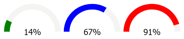
Shown when Color Type is set to Dynamic. A range of colors shown for the portion of the circular display that is "full" specified as list of numeric ranges and CSS colors. Ranges are specified as n1..n2|color. All values that fall within the range are assigned the color value. For example, the value range definition below defines three different colors to be used based on the control's value:
0..30|green
30..70|blue
70..100|red
Color Function
Shown when Color Type is set to Function. The Color Function is a JavaScript function called to get the color shown for the portion of the circular display that is "full". You define the JavaScript to execute in the property. Your code must return the color using the return statement. For example:
return 'blue';
Your code can reference the following variables:
- Variable
- Description
- value
The semi-circular number display control's value.
For example:
if (value < 30) {
    return 'green';
} else if (value < 70) {
    return 'blue';
} else {
    return 'red';
}
Color
Shown when Color Type is set to Static. The color used to fill the portion of the circular display that is "full". The color is defined as any CSS color value. Default value is #85eb85.
Show value
If checked, the value of the control is show as text in the middle of the control. By default, this property is checked.
Label Size
Shown when Show value is checked. The font size in points (pt) for the displayed control value. Default value is 20.
Label font
Shown when Show value is checked. The font face used for the value label. Default is Tahoma.
Label color
Shown when Show value is checked. The text color used for the value label. Default is black.
Label decimal points
Shown when Show value is checked. The number of decimal places to show for the displayed value. Default value is 0.
Label prefix
Shown when Show value is checked. Text to prefix to the displayed value.
Label suffix
Shown when Show value is checked. Text to append to the displayed value. Default value is "%".
Show end-point labels
If checked, displays the minimum and maximum number values at the start and end of the semi-circular number display control.
End-point start style
Shown when Show end-point labels is checked. The style applied to the label shown at the start of the semi-circular number display control.
End-point end style
Shown when Show end-point labels is checked. The style applied to the label shown at the end of the semi-circular number display control.
See Also